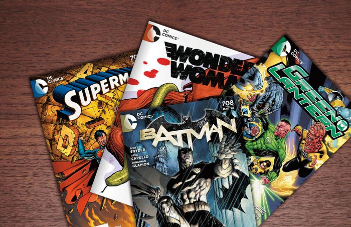
New DC Comics logo - Update
One week ago DC Comics filed for trademark protection on a new DC logo. First impressions of the logo were not great and many felt the new logo had too much of a corporate feel since it was devoid of color. As some suspected (and hoped), the logo we had seen was not the final product. The finalized logo(s) that have now been released are of the same design except that they now have a splash of color to them. More interestingly, the logo will be colored specifically for the comic that it is appearing on. This new edition to the logo vastly improves the look and gives the fans something that they can finally get behind. The design itself is also interesting.
"The design of the new DC Entertainment identity uses a “peel” effect – the D is strategically placed over the C with the upper right-hand portion of the D peeling back to unveil the hidden C – symbolizing the duality of the iconic characters that are present within DC Entertainment’s portfolio."
Expect to see this new DC logo on comics this coming March. After that, DC states the given some time fans will see the logo in film, television, interactive games and merchandise as well.
So how do you feel about the new DC Entertainment/DC Comics logo?
So how do you feel about the new DC Entertainment/DC Comics logo?


Source: DC Comics


Comments
Post a Comment